Color Theory & Psychology in Interior Design: Creating Emotionally Engaging Spaces
Color is one of the most powerful tools in interior design—it can transform a space, influence mood, and even affect decision-making. Whether you’re designing a calming bedroom, an energizing workspace, or a luxurious living area, understanding color theory and psychology is essential for creating balanced and impactful interiors.
Let’s explore how color works and how you can use it effectively in your designs.
1. Understanding Color Theory: The Science Behind Color Combinations
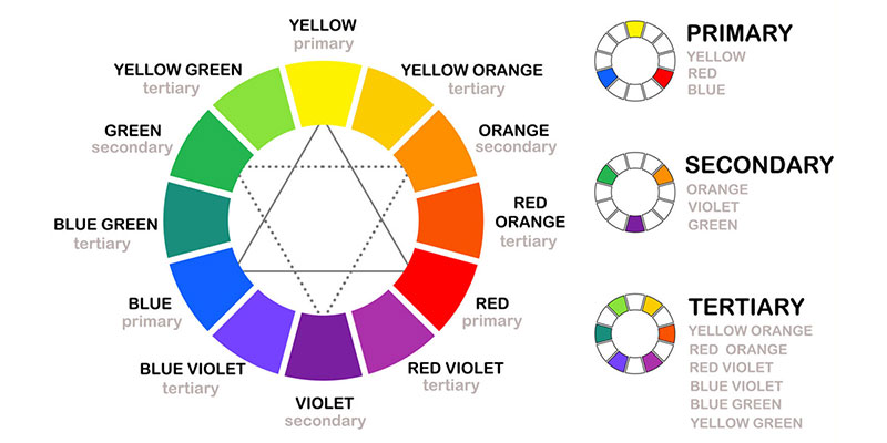
Color theory is based on the color wheel, a fundamental tool that helps designers create harmonious palettes. The three main color categories include:
🔹 Primary Colors – Red, blue, and yellow. These cannot be created by mixing other colors.
🔹 Secondary Colors – Green, orange, and purple, formed by mixing two primary colors.
🔹 Tertiary Colors – Colors like teal, magenta, and amber, created by mixing primary and secondary colors.
Popular Color Schemes in Interior Design
- Monochromatic – Different shades and tints of a single color (e.g., various tones of blue) for a sleek, modern look.
- Analogous – Colors next to each other on the color wheel (e.g., green, yellow-green, and yellow) for a harmonious and cohesive effect.
- Complementary – Opposing colors (e.g., blue and orange) for bold, high-contrast interiors.
- Triadic – Three evenly spaced colors on the wheel (e.g., red, yellow, and blue) for a vibrant and dynamic effect.
📌 Pro Tip: Use the 60-30-10 rule—60% dominant color, 30% secondary color, and 10% accent color—to maintain visual balance in a space.

2. The Psychology of Color: How It Influences Emotions
Colors don’t just enhance aesthetics; they evoke specific moods and emotions. Here’s how different colors impact interior spaces:
Warm Colors: Energizing & Stimulating
- Red – Passionate and bold. Great for dining rooms (stimulates appetite) and social spaces but should be used sparingly in bedrooms.
- Orange – Energetic and inviting. Works well in creative spaces and home gyms.
- Yellow – Optimistic and cheerful. Ideal for kitchens, entryways, and workspaces.
Cool Colors: Calming & Relaxing
- Blue – Tranquil and trustworthy. Best for bedrooms and offices.
- Green – Refreshing and balanced. Great for bathrooms, bedrooms, and wellness spaces.
- Purple – Luxurious and creative. Deep purples feel regal, while lavender tones create serenity.
Neutral Colors: Versatile & Timeless
- White – Clean, minimal, and spacious. Works well in modern interiors but can feel stark without texture.
- Gray – Sophisticated and neutral. Perfect as a base for accent colors.
- Beige & Taupe – Warm neutrals that bring coziness without overpowering a space.
📌 Pro Tip: Consider natural and artificial lighting when choosing colors—north-facing rooms may need warmer tones, while bright spaces can handle deeper hues.
3. Using Color to Enhance Interior Spaces
Now that we understand color theory and psychology, here’s how you can apply them effectively:
✔️ For Small Spaces → Use light colors to create openness (e.g., soft pastels, off-whites).
✔️ For Large Spaces → Darker tones add warmth and coziness.
✔️ For Productivity → Blues and greens boost focus and creativity in offices.
✔️ For Relaxation → Soft neutrals, blues, and muted greens enhance comfort in bedrooms.
✔️ For Social Spaces → Warm colors like red, yellow, or earthy tones encourage interaction.
Final Thoughts
Color is more than just a design choice—it’s a psychological tool that shapes how people feel in a space. By mastering color theory and understanding its emotional impact, designers can craft interiors that are not only beautiful but also deeply functional and emotionally resonant.
Which color scheme do you love using in your designs? Share your thoughts in the comments! 🎨✨
